Hi again!
So, I was trying to decide what I wanted to write about for my next blog post and I was having a hard time determining my topic. As I sat there, I realized that as owner, CEO, CFO, and janitor of my own company, I could write whatever I want. That in mind, this blog post will just be a few of my favorite shots from recently.....because.

Shot using available light and a small flashlight to accentuate some shadows from a retired cobweb.
The shot above was taken at a place located just outside of a dilapidated building downtown. It was shot using available light and a small flashlight to cast some shadows from a nearby cobweb. It's absolutely amazing how a room that you try to avoid when you don't need it, but desperately try to find when you do, can turn into a form of art after about 20 years of neglect, lol. I shot this wide open @1.8 on my 50mm. I think my ISO was somewhere in the 3000-4000 range, but since it was a relatively flat image (as far as light goes), I didn't have to worry about any highlights or shadows clipping. I bumped my clarity slider to help show some of the texture and raised my darker spectrum on the tone curve, to give it more of a muted look. It makes for a great background on my phone! haha.

Not quite sure of the purpose of this little piece of decor', but it presented itself to be a photographic opportunity ;)
Rule of thirds is great, but sometimes a direct, dead center photo composition can fit the bill. This was a table decoration at a local coffee shop here in town. I had a large window light coming in from the right side of the image. I tried my best to frame it in such a way that I didn't have to do any post production cropping, but I'm not always the best at that ;) I had to do a little bit of cropping, so that it would fit the vision for what I wanted the final product to be.
The bright white portion of the image on the right hand side of the bowl is actually slightly blown out: I had attempted to prevent my highlights from blowing out by simply decreasing my exposure by a stop or two and chimping at my camera's histogram. I apparently didn't do it quite enough, but it certainly helped prevent other areas from overexposure (as a side note, you can change your camera's metering options to meter off of a single spot, as opposed to an average of the entire framed image). However, take note that if you do decrease your exposure in camera, it will look pretty dark on the back of the camera's LCD. Don't worry about it too much, though, because with cameras these days, you can recover a lot of data from technically "underexposed" images: you can also use the "highlight" and "shadows" slider in Lightroom (LR) to recover some areas from either end of the spectrum. HOWEVER, if you do this, make sure you are shooting in the RAW file format, so as to keep as much information as possible. Okay, enough about this one. Let's move on to the last one......
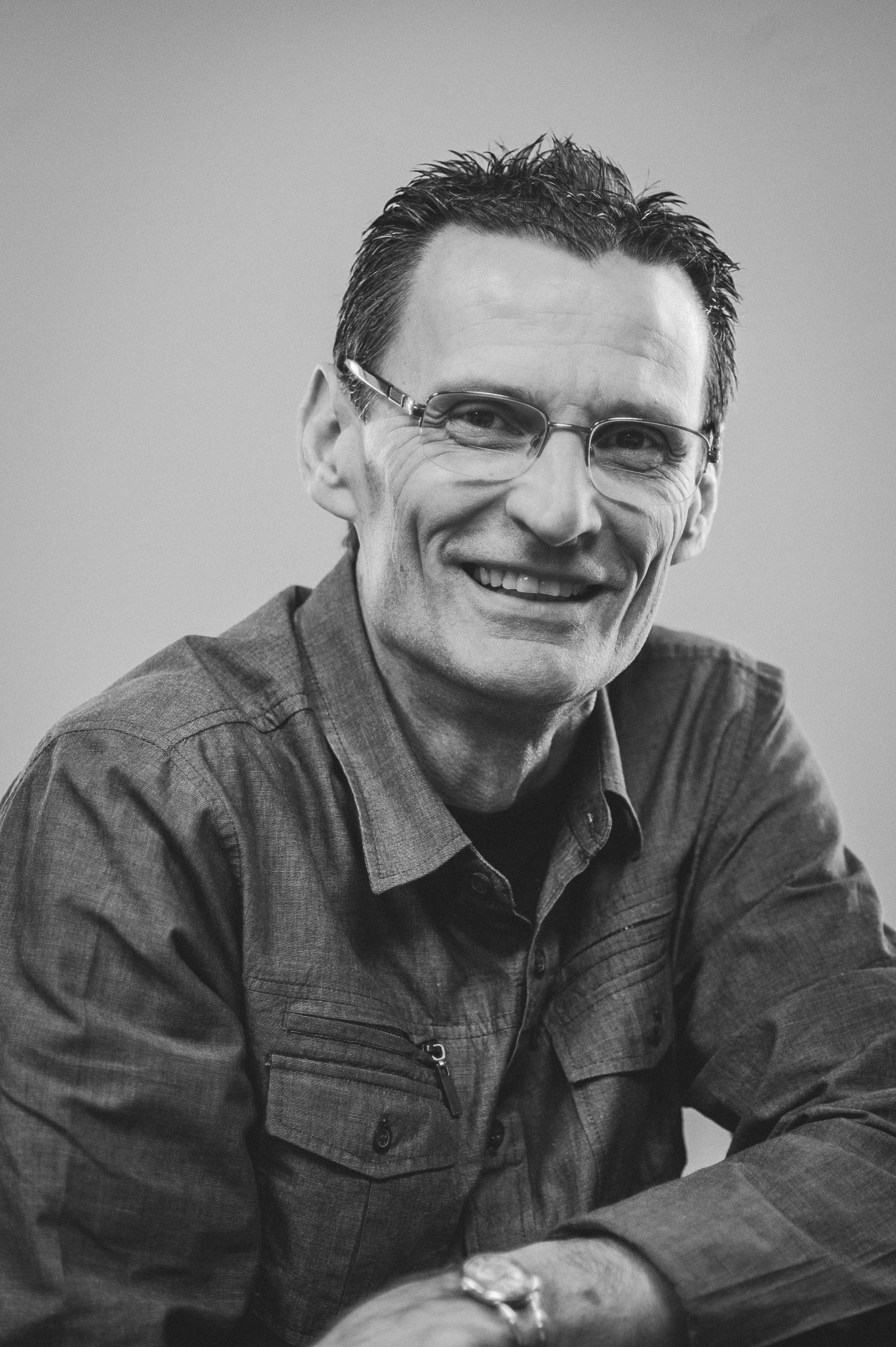
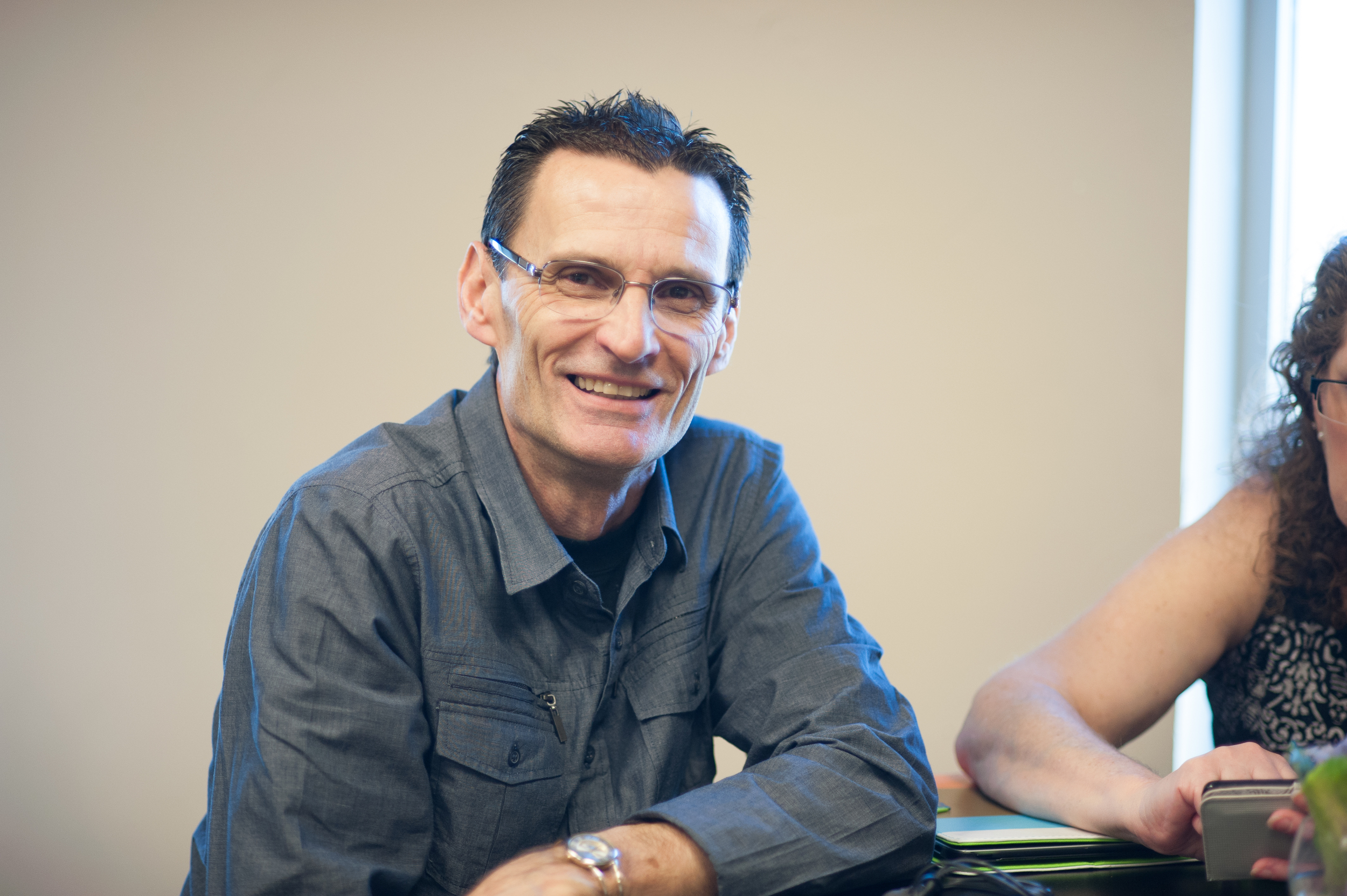
This is a photo of a good friend of mine. I included it, because I wanted to show how you can take a pretty bad snap shot and convert it into something that actually looks halfway decent (the things post processing can do these days, am I right?). Obviously, the top photo is the "after" and the bottom photo is the RAW "before" example.
So, one day your walking around with your camera and you take a snap shot of one of your friends. You wanted it to come out really well, but you were too far away and the lighting wasn't optimal. What do you do? Well, the same thing happened to me (as I'm hoping it does to you too?...yes.....please?).
To start off, I had too much distraction in the image via half of a woman to stage right....see, I can be funny. I decided that a portrait oriented would be the best choice. I did the appropriate cropping and added some localized contrast to his clothing and face. The backlight on the sides of his face and clothing was too blue for my tastes, so a black and white (B&W) conversion was my preference: I'm pretty sure I've said this at some point already, but I love B&Ws! I also added a slight vignette to allow the viewer to connect more with the subject. To recap, crop, contrast for punch, vignette.
Yes, I should have gotten the basics of the composition correctly, but that's what technology is for. I would like to add that when I have cropped a substantial amount, I will upscale my images to a preferred resolution, and add a bit more sharpening, to reduce the risk of pixelation and add a tad more....well....sharpness. There's obviously more to the creative process than these things, but it gives you the pith of my process.
Each person would shoot and edit each one of these differently, so get out there a start developing your style!
Here are a few others.....just tap to view them individually.


If you're reading this, thanks for the added traffic to my website! These blogs help with search engine optimization (SEO) and you get to be a part of it, awwwww. Seriously though, thanks for letting my share a little bit of my love for photography with you. If any of the millions of people that read this like what they see, like, share, and comment.
P.S. I would absolutely love to take photos of you and your family, graduating seniors, or any couples you know! For quotes and availability, send me an email at austin@austindanielphoto.com, or fill out the form on my Contact Me page.